The aprons fail to challenge my discipline of creative pattern cutting as the styles I have been drawing within research are rather simple in shape. However, working with a simple product such as aprons, does present an ideal opportunity for me to develop my digital illustration skills and to explore the digital print facilities available to me at the university (see blog post 8). Both of which will feature in my Final Major Project next term.
Despite having attended a basic ‘Introduction to Illustrator’ class as part of my workplace CPD, I had very limited skills in using the Adobe software. I am acutely aware that this lack of knowledge ‘holds me back’ in many ways;
When communicating my ideas in a professional manner for my MA studies.
When teaching my students skills in fashion communication.
When applying for jobs (as many roles require digital skill set in this software).
I reach out to colleagues, team mates and friends for guidance. They are very generous and patient with me as I express to them my desire to design around 15 aprons. I would like the digital drawings to show both front and back designs, coloured and non-coloured. This is because I know from my experience as a garment technologist that ‘flat’, technical, line drawings are an essential tool in communication between design and manufacture. By learning the skills to ‘drop colour’ into them I will be able to play with colour and print arrangements much more quickly than drawing by hand (and ultimately reach the most informed and successful outcome when producing final products).
By drawing on top of a figure template I am able to achieve balance and proportion much more effectively and can ‘hide’ this layer when presenting my designs (figure 1).
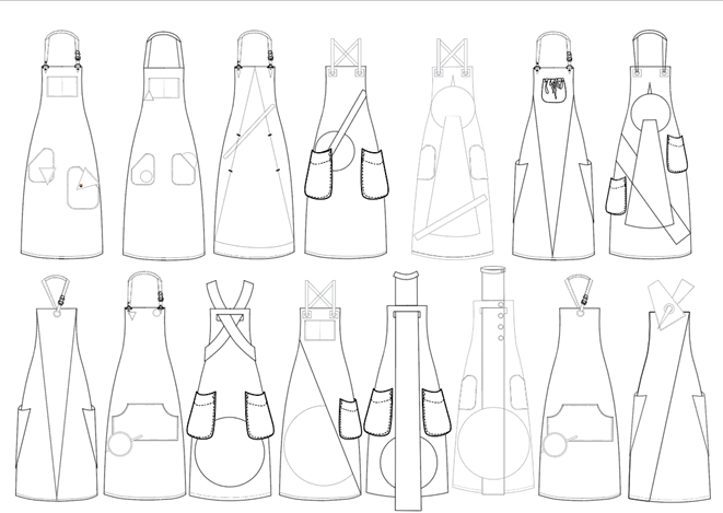
I drew each apron as a separate Illustrator page, and it wasn’t until seeing the drawings alongside one another in the arrangement above that I could see the discrepancies between line thickness. I believe this to be because I imported some details such as pockets from a library of Illustrator fashion drawings from WGSN. Despite this error I am happy with my first attempt at drawing digitally and can feel my pace quickening as I get used to the positions and functions of the ‘tools’.
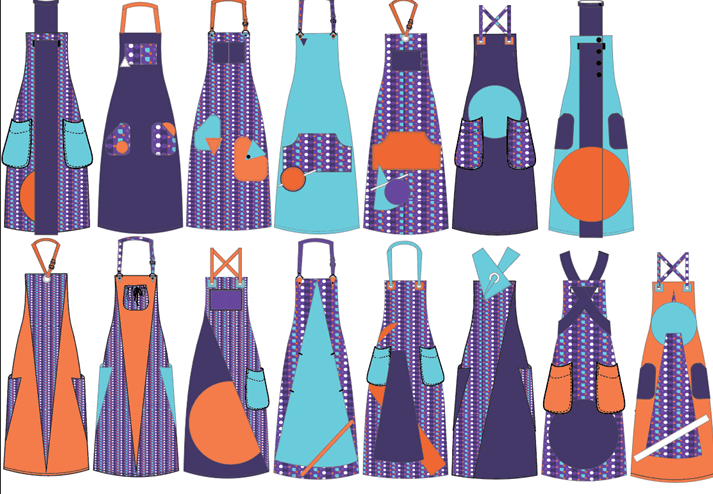
I go on to add colour to these drawings, using the ‘eye dropper’ tool to select the exact colours from the project brand identity (figure 2).
In all honesty, I think that I felt embarrassed by my previous lack of digital communication skills and felt somewhat ‘left behind’ or that my hand drawn work was ‘old fashioned’. However, I now feel satisfied to present this line up to my group for final selection. The final range of four aprons can be seen in figure 3.
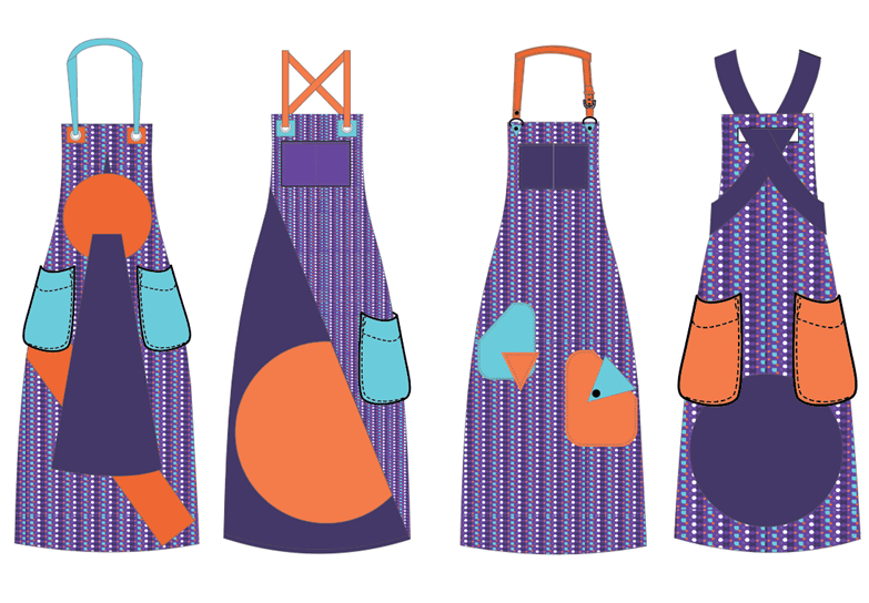
The range heavily focuses upon the print – reaffirming the brand identity whilst echoing the 3D shapes that featured in the aesthetic direction on the Miro board. There are useful pockets (essential when considering user needs) and the variety of neck straps and fastenings means that the range is adaptable and inclusive to all body shapes and practical needs such as restricted movement.
Next Steps;
- Pattern cut and make the final aprons
- Plan photography of final product
- Prepare content for the presentation with the group
